
How one infographic saved me 3 hours

True story from last week:
I was analyzing Applied Materials and needed to understand their pricing power, specifically, how capital intensity affects their ability to raise prices without losing customers.
Old way: I’d spend 2-3 hours reviewing notes, re-reading articles, trying to piece together the framework.
New way: Pulled up the “Pricing Power Framework” infographic, saw the exact factors that determine pricing power (switching costs, market structure, customer concentration), and applied it to AMAT’s situation. Done in 20 minutes.
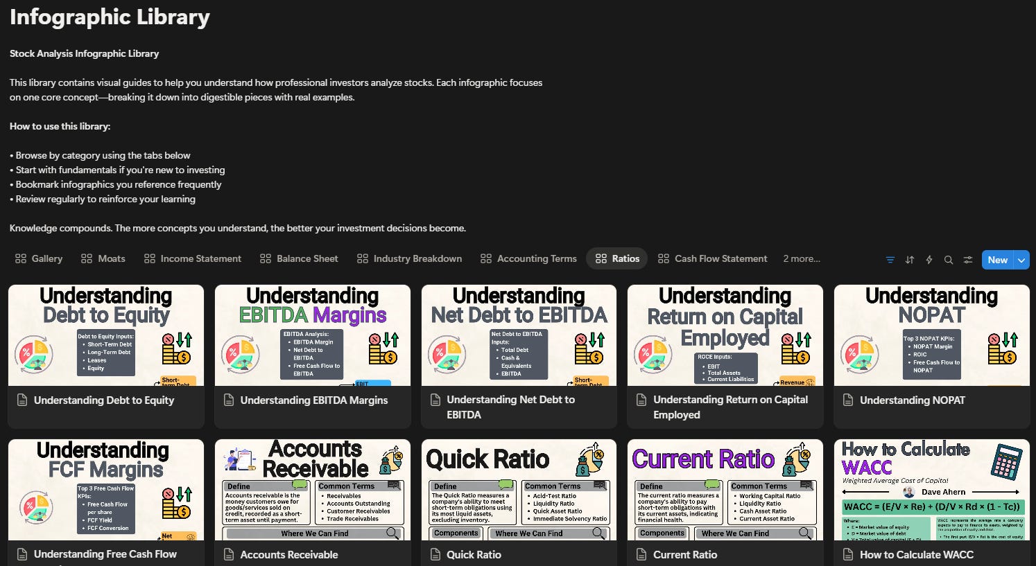
That’s one infographic. There are 170+ more.
Here’s what subscribers are using them for:
“I keep the capital allocation infographic open whenever I’m reading earnings calls. Game changer for understanding management decisions.” - Mike.
“The DCF assumptions breakdown helped me finally understand what actually matters in valuation models vs what’s just noise.” - Sarah.
“I use the income statement quality checklist every time I analyze a new stock now. Catches red flags I used to miss.” - James.
The library isn’t about consuming more content. It’s about having the right framework at the right moment so you can make better decisions faster.
Tomorrow I’ll address the question everyone’s asking.
Dave