

Most dividend cuts are no surprise. They are a slow leak the market ignored until the day it could not.
The payout ratio everyone quotes misses most of them, because a company can look fine on earnings while the cash tells a different story. So I stopped relying on one number and built a scorecard that grades any dividend on a 0 to 5 scale, where 0 is unsafe and 5 is safe.
In today’s post, we will discuss:
What the 0 to 5 safety score actually measures
The five metrics that go into it, and how each one is scored
The one hard rule that caps the whole thing
Two companies scored from front to back, Procter & Gamble and Verizon
How to use the score in your own process, and where it goes wrong
Okay, let’s dive in.
What is the score?
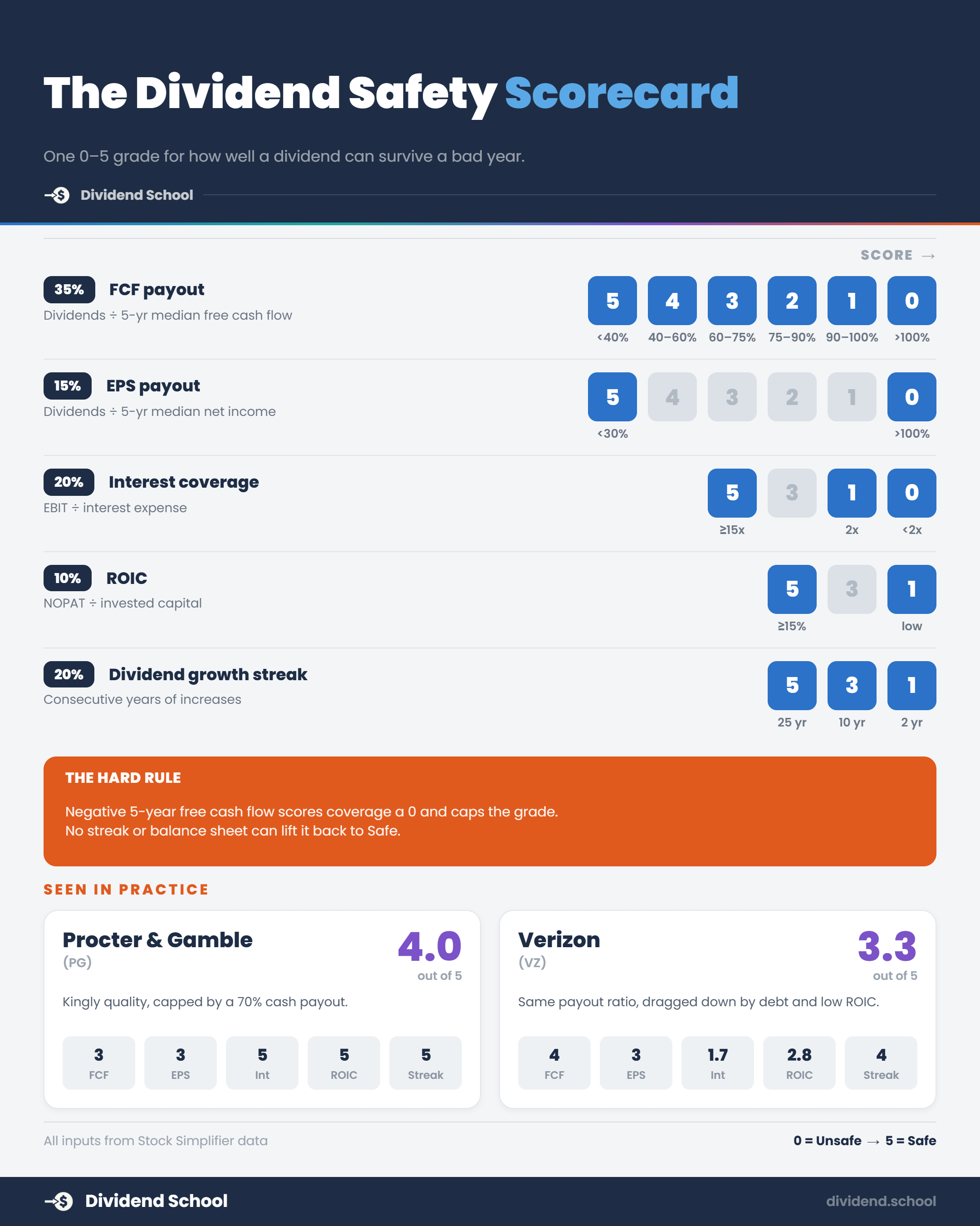
The safety score is a single grade from 0 to 5 that answers one question: how likely is this dividend to survive a bad year.
A 5 means the payout is protected from several directions at once. A 0 means the company is paying you with money it does not really have. Everything in between is a matter of degree.
The score is my rules run on Stock Simplifier’s data. Five plain metrics, each scored on a fixed curve, are then weighted by how much that metric actually forces a cut in the real world.
Here is the weighting:
FCF payout: 35%
EPS payout: 15%
Interest coverage: 20%
ROIC: 10%
Dividend growth streak: 20%
Coverage carries the most weight because a dividend is paid in cash, and coverage is the metric that asks whether a normal year of cash covers the check. The other four surround it. One second opinion on affordability, one balance sheet stress test, one read on business quality, and one long memory of how the company behaves when times get hard.
Let’s walk through each one.
The five metrics
FCF payout (35%)
This is the heavyweight.
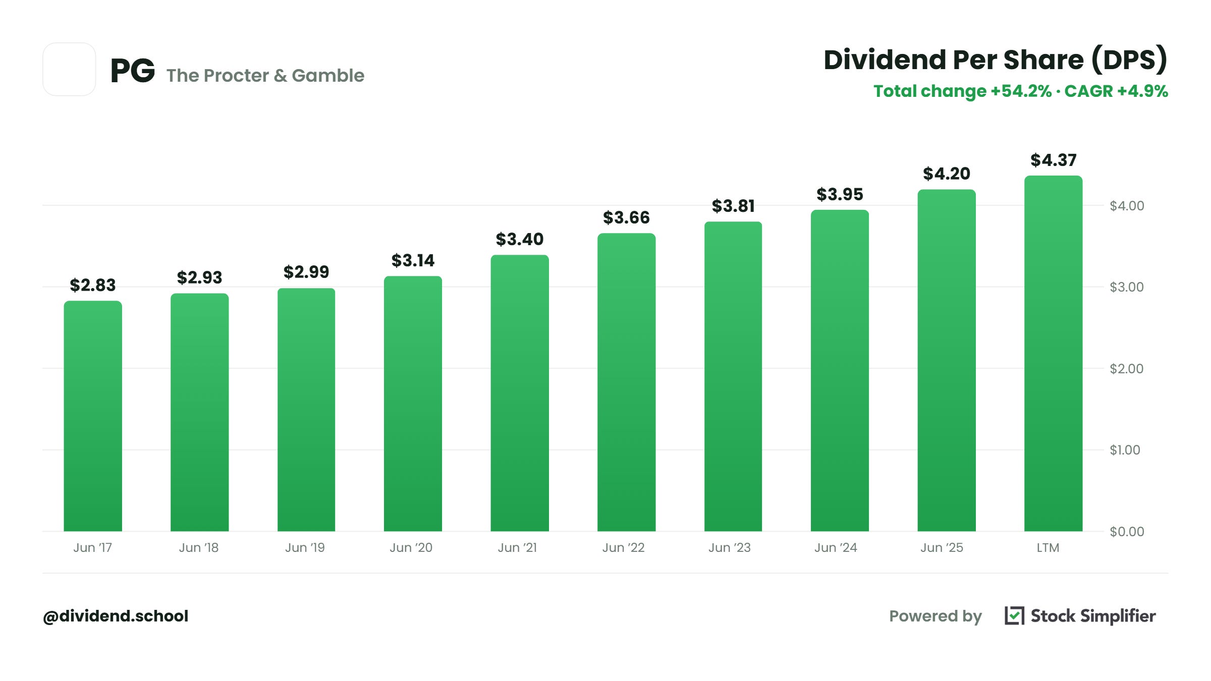
Take the latest cash dividends paid and divide by the five-year median free cash flow. Free cash flow is operating cash flow minus capital spending, the money left after the business pays to keep the lights on and grow.
I use a five-year median on purpose. One good year can flatter a payout, and one bad year can scare you out of a fine one. The median smooths both.
Here is the curve:
Under 40%: 5
40% to 60%: 4
60% to 75%: 3
75% to 90%: 2
90% to 100%: 1
Over 100%: 0
A company paying out 35% of its cash has room to keep paying through a rough patch. A company paying out 95% is one bad quarter from a hard decision.
EPS payout (15%)
This is the second opinion.
Latest cash dividends divided by the five-year median net income, counting only the years with positive net income. Under 30% earns a 5, and it steps down to 0 once the payout climbs past 100% of earnings.
When the two payout metrics agree, you can trust the read. When they disagree sharply, that gap is telling you something about cash conversion, and it is worth a closer look before you buy.
Interest coverage (20%)
This is the balance sheet check.
Operating profit (EBIT) divided by interest expense. Over 15x scores a 5, and it steps down to a 1 at 2x, then 0 below that.
Why it matters: when a business hits a rough patch, the interest gets paid before the dividend does. Lenders are first in line and shareholders are last. A company earning 15 dollars of operating profit for every dollar of interest has enormous room if rates rise or profits dip. A company at 2x has almost none, and its dividend is the first thing on the chopping block.
ROIC (10%)
This is where business quality shows up.
Return on invested capital is NOPAT divided by invested capital, where NOPAT is EBIT times one minus a 21% assumed tax rate. Over 15% earns a 5 and it steps down from there.
A company that earns high returns on capital does not have to plow as much back in to grow. That leaves more cash for shareholders, year after year. High ROIC is the quiet engine behind a dividend that keeps rising.
Dividend growth streak (20%)
This one does double duty.
It counts how many years in a row the per-payment dividend has increased. Twenty-five years scores a 5. Ten years scores a 3. Two years scores a 1.
The streak rewards a track record, and it silently tests recession behavior at the same time. A company that cut in 2008 or 2020 had its streak reset to zero, and it is still rebuilding. The number of years is a receipt for how the company treated its dividend the last time the economy broke.
The one rule that caps everything
There is a hard floor under this whole model.
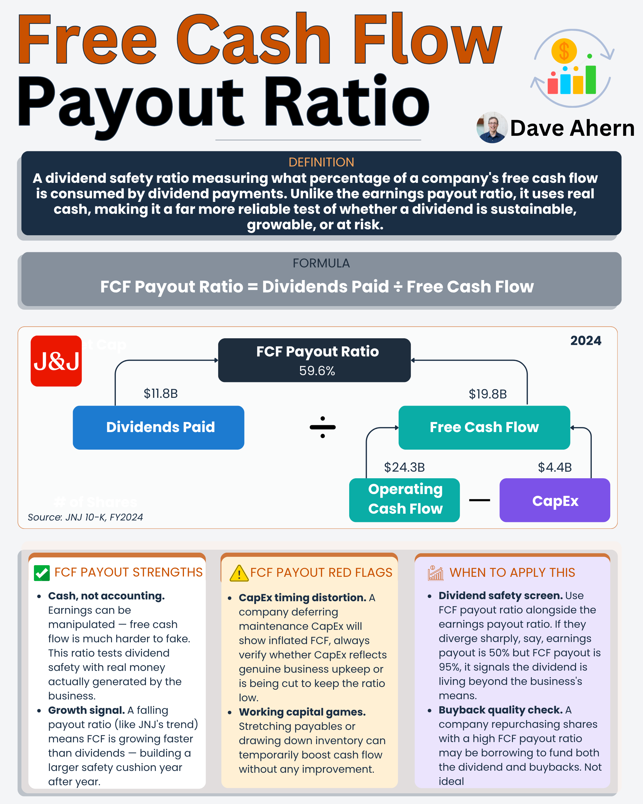
If the five-year median free cash flow is negative, the dividend is not being funded by the business. It is being funded by debt, by asset sales, or by diluting you. So the FCF payout metric scores a 0, and that 35% weight drags the whole grade down into unsafe territory no matter what else is going on.
A fifty-year streak does not save you here. Neither does a fortress balance sheet.
If the cash is not there, nothing else on the scorecard can pretend it is.
Let’s score two companies
Numbers make this real, so let’s run the scorecard on two dividends that look similar from a distance and score far apart up close.
Our guinea pigs are Procter & Gamble (PG) and Verizon (VZ). Both are giant, household-name payers. Both have raised their dividend for many years. On the surface, you might grade them the same.
The score pulls them apart.
Procter & Gamble
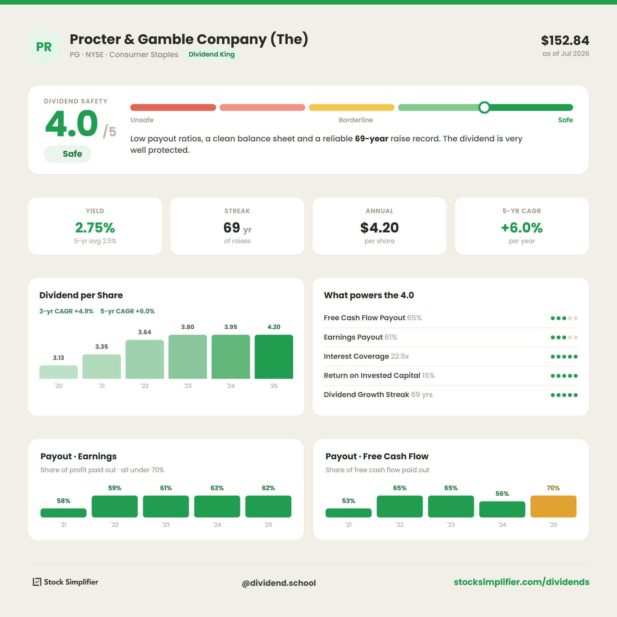
PG’s fiscal year ends in June, so we are using fiscal 2021 through 2025.
FCF payout: dividends of $9.9B against five-year median FCF of $14.0B is about 70%, which lands in the 60% to 75% band. Score: 3.
EPS payout: those same dividends against five-year median net income of $14.7B is about 67%. Score: 3.
Interest coverage: fiscal 2025 EBIT of $20.5B against interest expense of $0.9B is roughly 22x, well over the 15x ceiling. Score: 5.
ROIC: NOPAT of about $16.2B against invested capital near $87B is about 15%, above the 15% mark. Score: 5.
Dividend growth streak: 69 straight years, a Dividend King several times over. Score: 5.
Blend those by weight and PG lands at 4.0 out of 5.
Notice what is holding it back. Not the balance sheet, not the quality, not the streak. It is the payout coverage, the heavyweight, sitting in the middle band because capital spending stepped up and pushed the cash payout toward 70%. Even a 70-year king does not get a free pass on the metric that matters most.
Verizon
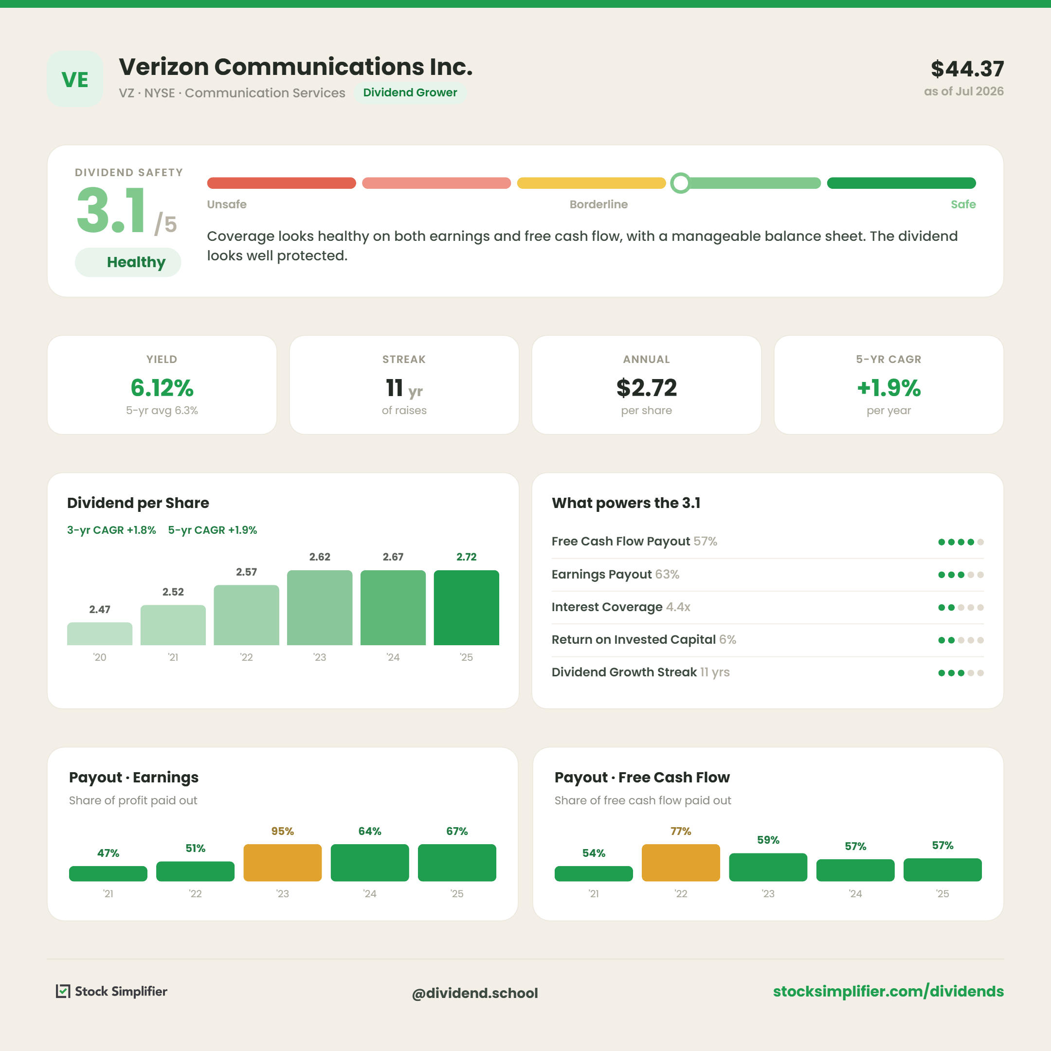
Verizon’s fiscal year ends in December, so we are using 2020 through 2024.
FCF payout: dividends of $11.2B against five-year median FCF of $19.3B is about 58%, inside the 40% to 60% band. Score: 4.
EPS payout: those dividends against five-year median net income of $17.8B is about 67%. Score: 3.
Interest coverage: 2024 EBIT of $28.7B against interest expense of $6.6B is about 4.4x, closer to the 2x floor than the 15x ceiling. Score: about 1.7.
ROIC: NOPAT of about $22.7B against invested capital near $269B is about 8%, well short of the 15% mark. Score: about 2.8.
Dividend growth streak: 11 straight years, respectable but not a king. Score: 4.
Blend those and Verizon lands at 3.1 out of 5.
Here is the part worth sitting with. On the single metric most investors check, cash payout, Verizon actually scores higher than PG. Its dividend eats a smaller slice of free cash flow.
If the payout ratio were the whole story, you would call Verizon the safer dividend. The scorecard says the opposite.
What separates them is everything the payout ratio cannot see. Verizon carries a mountain of debt, so its interest coverage sits near the floor at 4x while PG sits at 22x. And Verizon earns about 8% on its capital against PG’s 19%, so far less cash is left over after the business feeds itself. Two companies, similar payout ratios, and a full point of safety between them once you look at the balance sheet and the returns.
That gap is the entire reason a dividend needs five scores, not one.
You now have the five metrics, the curves, and two worked examples you can copy onto any dividend you own.
This week’s members’ deep dive is the instrument firing. I ran this exact scorecard, line by line, on a wide-moat compounder the market has cooled on, and the score landed in a place that surprised me. That workup, plus the one line on its scorecard I am watching into next year, went to members last Saturday.
How to use the score in your process
Treat the number as a starting point, not a verdict.
A 4 or 5 means the dividend is well protected and you can spend your research time elsewhere. A 2 or 3 means dig in, because the score is flagging a specific weakness, and your job is to find out whether it is temporary or structural.
Anything at 1 or 0 is telling you the market may be right to doubt this payout.
The most useful move is to read the metric scores, not just the blend. PG and Verizon both land in the 3 to 4 range, but for opposite reasons. PG is capped by a mid-band payout on an otherwise pristine business. Verizon is dragged down by debt and low returns on an otherwise affordable dividend. Same neighborhood, completely different risks, and only the individual scores tell you which one you are holding.
Where the score falls short
No single grade captures everything, and this one has real limits.
It is backward-looking by design. The streak and the five-year medians reward what a company has already done, so a business in the middle of a turnaround can score worse than its future deserves, and a company about to stumble can still look clean for a year or two.
The curves also assume a normal, capital-light industrial or consumer business. Banks, insurers, REITs, and MLPs run on completely different plumbing, so a raw interest-coverage or FCF-payout reading misleads you badly. Stock Simplifier’s scoring adapts the metrics for those business models, and you should never grade a bank on the same curve you use for Procter & Gamble.
And a high score is a statement about safety, not value. A perfectly safe dividend on an overpriced stock is still a mediocre investment. Safety tells you the payout will likely survive. It says nothing about the price you paid for it.
Run the scorecard on three dividends you own this week and read the five metric scores, not just the final grade. The weak line is where your next hour of research belongs.
With that, we will wrap up today’s article.
If you have any questions or if I can help in any way, please let me know.
Take care and be safe out there,
Dave
P.S. If this scorecard changed how you would size up even one dividend you own, that is the whole point. Dividend School sends one teaching piece like it every week, free, and you can leave any time.